Turning Skepticism into Confidence Through UX
Turning Skepticism into Confidence Through UX
6 min read
6 min read

About
Redesigning Ribogrow’s digital experience around trust, clarity, and user education — balancing business needs with user needs in a sensitive market. This project was selected for the Hackshow (top projects showcase) and reflects my approach to blending UX, storytelling, and research-driven design.
Role:
UX/UI Designer (Research, Strategy, Writing, UI Design, Prototyping)
UX/UI Designer (Research, Strategy, Writing, UI Design, Prototyping)
UX/UI Designer (Research, Strategy, Writing, UI Design, Prototyping)
Team:
2-person team with Bas
2-person team with Bas
Timeline:
2 week design sprint
Tools:
Figma, Prolific, Google forms, Figjam Notion
Deliverables:
UX strategy, user personas, mid- and hi-fi prototypes, responsive site
UX strategy, user personas, mid- and hi-fi prototypes, responsive site
UX strategy, user personas, mid- and hi-fi prototypes, responsive site
The Brief
Our client, Ribogrow, is a Berlin-based startup offering a non-prescription tonic powered by a newly researched natural sugar, 2-deoxy-D-ribose.
Our goal? To design a digital experience that could optimise the buying experience for users on their online store.
Our client, Ribogrow, is a Berlin-based startup offering a non-prescription tonic powered by a newly researched natural sugar, 2-deoxy-D-ribose.
Our goal? To design a digital experience that could optimise the buying experience for users on their online store.
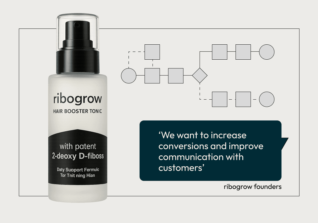
The UX brief from the ribogrow founders
Getting ghosted when we tried to talk about hair loss
A sensitive topic
It’s fairly evident how common hair loss is, but in case you were wondering - up to 85% of men and 40% of women (this one did surprise me) will experience it in their lifetime — despite this, it’s still surrounded by shame, stigma & misinformation. Especially for young adults.
From the outset, it became clear that this wasn’t something we could easily talk to people about. Hair loss is deeply personal — and many people we raised the subject with weren’t ready to acknowledge it, let alone talk to us about it.
The numbers
We used Prolific to reach our defined target group: men aged 18–40 across the EU, statistically the most likely to be experiencing early hair loss - and the desired demographic for Ribogrow.
We collected 110 survey responses and conducted 5 in-depth interviews.
Our survey revealed two main tensions:
Trust — 89% of respondents said scientific evidence was important, but 66% said they couldn’t tell if that science was real or just marketing.
Awareness — almost half hadn’t heard of any hair loss treatments at all, and very few were familiar with our client’s hero ingredient, 2-deoxy-D-ribose.
A selection of stats from our survey respondents
Three core themes from our interviews
A deeper understanding
From our user interviews, we identified three core themes from our that shaped the rest of the project:
Deep scepticism toward marketing claims and cosmetic ‘solutions’
the emotional impact of hair loss
A lack of accessible education or support
It became clear from our research that marketing of hair loss solutions was actually a big part of the user problem related to this topic. It was important to us from this point on, not to build another website that contributed to the noise.
Our goal was to earn trust, not pressure people to buy through fear — and to build an experience that could add some educational value, not just sending people down a conversion funnel.
Meet Finn
We distilled our insights into one key persona: Finn, a 23-year-old student quietly panicking about early hair loss.
He’s image-conscious and overwhelmed by conflicting advice - having fallen victim to ineffective influencer-promoted products. Despite the need for more information, he feels some shame around his hair loss - and isn’t ready to talk to a doctor yet. He’s looking for clarity, not pressure.

Meet Finn, the silent worrier - who we designed the product around
Meet Finn, the silent worrier
The 'how might we' questions that shaped the product
Framing the Challenge
Finn’s predicament helped us to start envisioning what the product should feel like. This was a first point of entry for users who are anxious, unsure who to trust, and becoming sceptical of anything that feels like a marketing gimmick.
This helped us form our four guiding “How Might We” questions:
Build trust without making unsupported medical claims
Explain the science without alienating users with jargon
Compare Ribogrow with other options without leaning into hype
Keep users engaged beyond the checkout, without pressure
Everything that followed — from content hierarchy to product descriptions to tone of voice — was driven by this principle:
How do we convert customer without becoming part of the problem?
Ideation & Early Testing
We kicked off ideation with sketches of potential features and elements — fast, rough, and wide-ranging.
From that, we aligned on an MVP:
A simple, trustworthy webshop that explains the science, meets users where they are emotionally, and makes it easy to try Ribogrow.
We prioritised our must-have features and mapped out a user flow balancing education and conversion (see diagram).
Bas managed to quickly mock up some lo-fi frames - while my mind was already a couple of steps ahead, thinking too early about copy and tone of voice.
We tested of lo-fi flow straight away and learned a lot: people needed clearer context, more guidance, and room to explore at their own pace.
The feedback shaped our mid- and high-fidelity designs going forward.

A visualisation of our initial ideations

How continual user testing shaped our design throughout
Building and testing
We split the work across different parts of the user experience - I focussed on storytelling pages - the home screen and hair loss facts page, and Bas worked on the product page and checkout workflow - we tested these continually in mid-fi.
We adjusted the user flow, added strategic entry points, adjusted CTAs, and developed a quiz for further engagement based on user feedback.
Trust emerged as the dominant theme from user testing. In response, we integrated trust indicators throughout the journey — recognisable brands, subtle social proof, and photo-enhanced reviews. These elements served as reassuring touch-points to build product confidence as the user moves through the product.
UX writing also proved crucial to the project's functionality. While aiming for a calm, supportive tone, we discovered that certain phrases resonated poorly or even triggered negative responses. This meant we had to continually iterate our messaging as we moved through our design and testing phases.
Visual Language
We wanted the design to feel calm, credible, and reassuring.
We kept Ribogrow’s logo and typeface, but adapted the visual language based on our research - creating a look that nodded to science without feeling clinical — clean layouts, lots of white space, muted tones, and icons to break down more complex information.
With accessibility in mind, we ensured AA contrast and type standards throughout — keeping it inclusive without losing that premium pharma-cosmetic feel.

Our style tile - enhancing ribogrow's visual language
Final prototype

Home page
Finn lands from an article. He’s met with white space, trust signals, expert quotes — enough to feel like he’s in the right place, but not so much that it overwhelms. He can scroll, skim, or dive deeper.
Science page
This is where we do the heavy lifting: causes of hair loss, treatment options, clear comparisons. Everything’s broken down visually. No jargon, no fluff. Just useful, evidence-led info that builds trust as you read.
Quiz
Still unsure? He can take the quiz. It’s friendly, gender-neutral, and gently informative. At the end, we don’t push the product — we position Ribogrow as one option before moving on to more extreme treatments.
Product page
If Finn’s ready, he can check out the tonic. We give him the info he needs — what it is, how it works, what other users have said. Trust is already high by this point, so it doesn’t need to shout.
Checkout flow
Simple, fast, discreet. Guest checkout, minimal fields, optional add-ons. No pressure, no hard sell.
Post-purchase
Order confirmed. He gets the option to explore more, stay engaged, or just move on with his day. That’s it — no endless upselling, just a clean close to the experience.
User responses from our desirability testing
Desirability & Stakeholder Feedback
As we wrapped up our hi-fi prototype, we ran a desirability test to gut-check how it was landing.
Trustworthy, high-quality, calming, and professional.
This aligned closely with the experience we were trying to build — one that felt clear, reliable, and reassuring from the first scroll.
We presented the project to a group of our peers and received a positive response:
10 out of 11 participants rated the presentation style highly
7 out of 11 thought the product felt innovative
And most importantly, 8 out of 11 said they’d buy it
This suggested that even with limited context, people felt confident enough in the product and experience to say yes.
Following our presentation, our project was also nominated for the Hackshow — a showcase of the top projects selected from each cohort in our bootcamp, where finalists present their work to a wider audience of industry professionals, alumni, and peers.
Final Reflections
Trust became the thread that ran through every part of this project.
The challenge was a subtle one: create a user experience that felt credible and supportive, for a topic that’s emotionally loaded and easy to get wrong. We didn’t want to contribute to the noise — but aimed to deliver a clear design, grounded in empathy and backed by research.
If we had more time, I’d want to go deeper into:
Designing for women and other use cases, like post-transplant users
Exploring deeper engagement after purchase - a more interactive dashboard with space for photo uploads and regular tips.
A-B testing for improved IA, storytelling and tone of voice
An opportunity to explore subtle micro-interactions and motion design to make the site more dynamic and engaging, while retaining its emphasis on trust and user guidance.
For me personally, this project was a chance to bring some of my background in tone, storytelling, and clarity into product work. It may not quite have been the flashy, experimental project I had expected for my final UX/UI bootcamp project — but it was user-led and iterative. We focused on building something that actually helps people - and this will shape a lot of my UX thinking going forward.

Mockups from our final mobile version


Sitemap
Follow
Let’s make something great
Whether you’re hiring or just curious, I’d love to hear from you.
© James McBreen 2025
Follow
Sitemap
Let’s make something great
Whether you’re hiring or just curious, I’d love to hear from you.
© James McBreen 2025
Sitemap
Follow
Let’s make something great
Whether you’re hiring or just curious, I’d love to hear from you.
© James McBreen 2025